THEMING & BRANDING
Salesforce, Experience Cloud
OBJECTIVE
The goal was to increase styling options for site builders and admins while reducing the need for programmatic styling overrides when building a site. To accomplish this, I updated the site wide styling properties including: colors, text, spacing, buttons, and imagery. These updates further strengthened the declarative theming and branding capabilities of Experience Builder.
ROLE
Lead Designer
TEAM
UX, Product Management, Engineering, Research

01
CHALLENGE
The existing site wide styling properties on Experience Builder were not sufficient for customers who wanted their site style to reflect their brand identity. Users would typically start the styling process in the builder by using the styling properties and then be forced to finish programmatically - using custom CSS overrides in order to achieve the desired result.
This declarative cliff was a huge hinderance and also prevented many potential customers from adopting the platform. Since the builder codebase was being rebuilt with more performant technology, the timing was perfect to address and fix the site wide styling properties.
EXISTING BRANDING PROPERTIES

1. colors before
2. fonts before
3. images before
02
APPROACH
(DRAFT) Programmatic - In order for styling properties to work, we also needed to update our CSS styling library so that developers and designers building new components could consume the new styling properties.
Interviewed several site-builders to determine the frequency and order of importance for users when styling a site. Determined that users generally considered colors the most important followed by text, spacing, and imagery.
CSS STYLING HOOKS

1. CSS Styling hooks
STYLING PANEL EXPLORATIONS

1. Description of explorations
03
SOLUTION
Through surveys and interviews, it was determined that users wanted a more balanced offering of granular controls that could also be broad enough to apply site wide. The tricky part was determining which styling properties belonged in the theme panel and which would appear on a per-component basis.
COLORS

1. Lorem Ipsum
2. Lorem Ipsum
3. Lorem Ipsum
4. Lorem Ipsum
5. Lorem Ipsum
TEXT
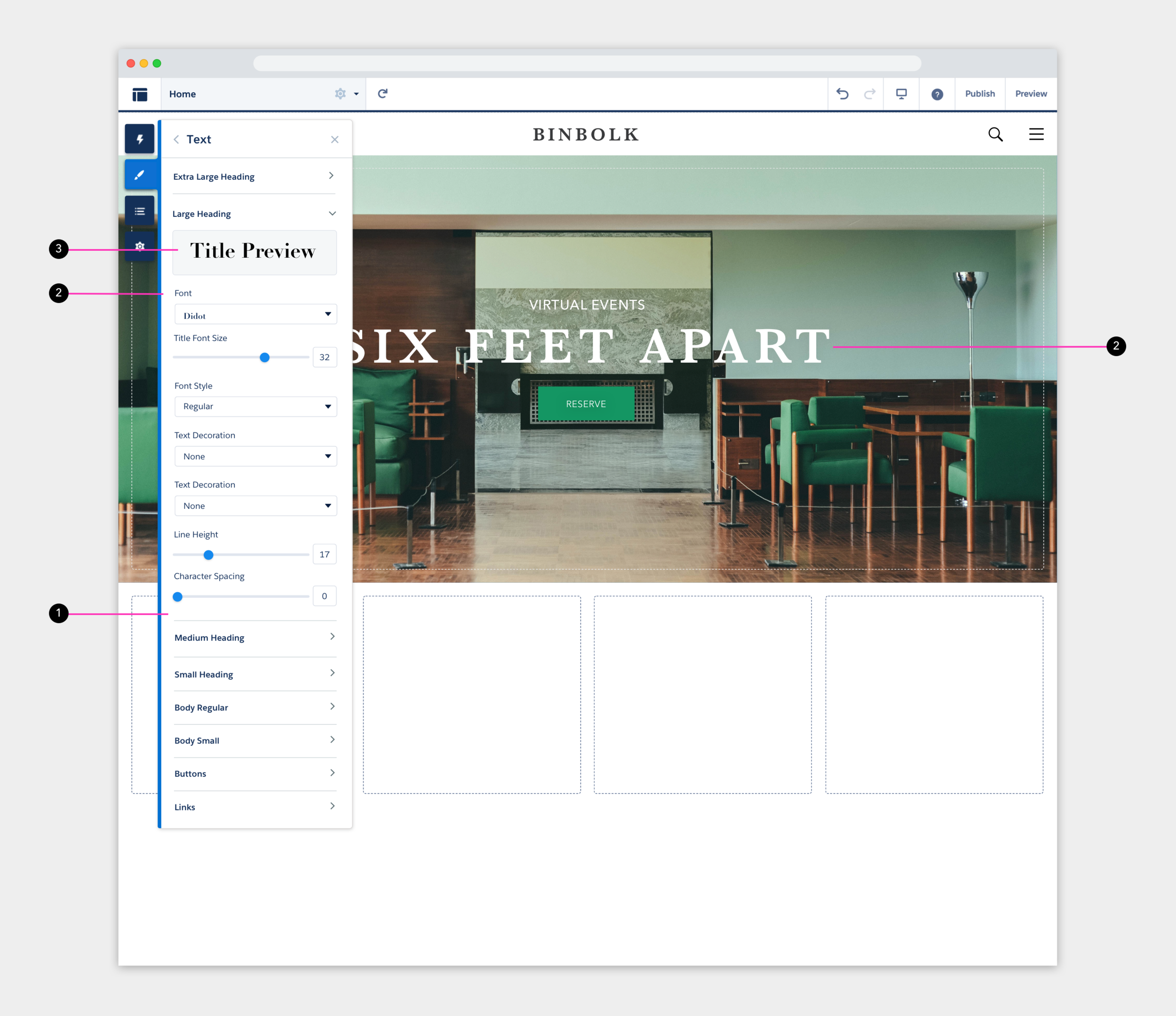
4 headings, 2 body, button, links
IMAGES

1. Consolidated into one DAM (Data Asset Manager). Previously two DAMs (DRAFT)
SPACING
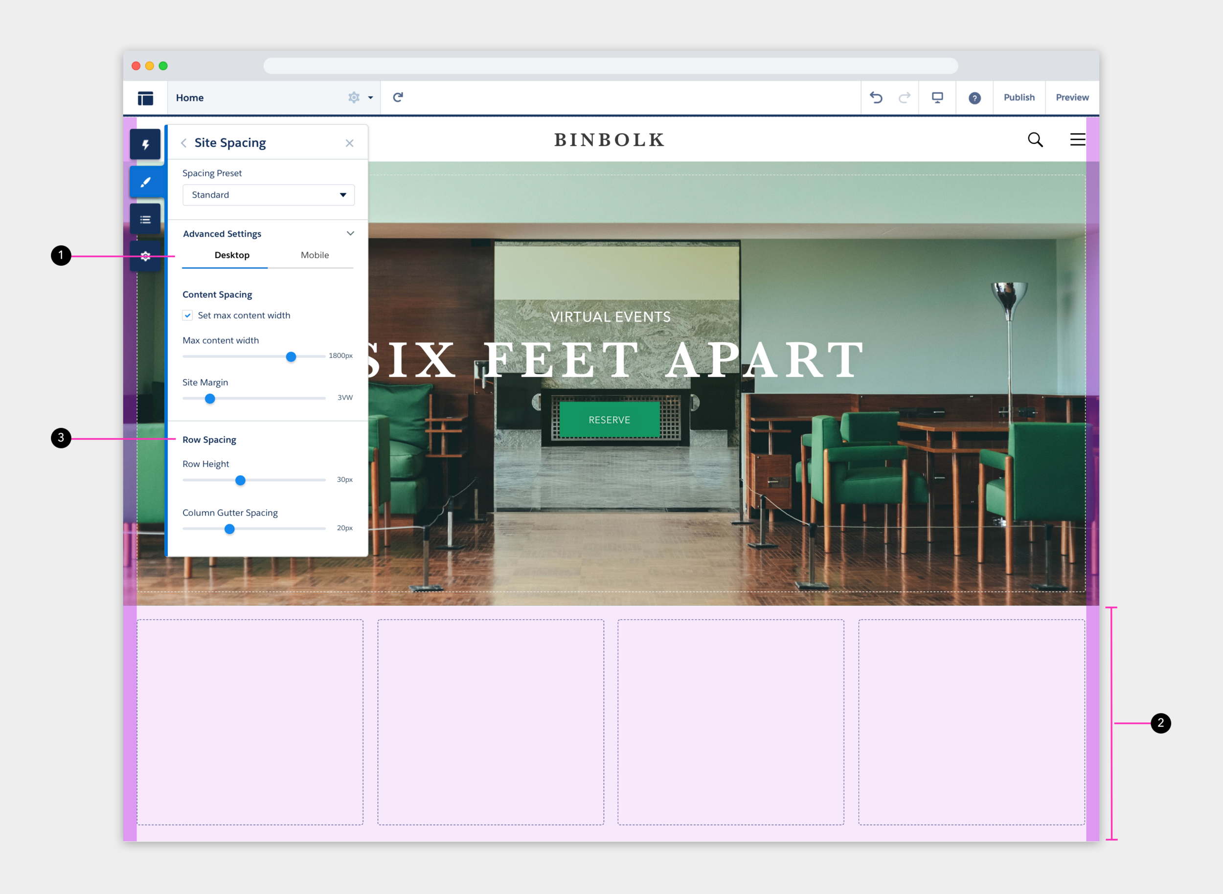
1. Spacing
04
IMPACT
(DRAFT) Reduce implementation costs
Get more customers
Compete better with the likes of Adobe AEM