FLEXIBLE LAYOUTS
Salesforce, Experience Cloud
OBJECTIVE
The goal of this feature was to allow users to quickly create and manage any page layout using point-and-click UI instead of relying on custom programmed layouts or the existing fixed page layout options. Doing so would reduce build time and implementation costs for our customers and also represent a major step towards the goal of turning Salesforce Experience Builder into a truly declarative site building platform.
ROLE
Lead Designer
TEAM
UX, Product Management, Engineering, Research

01
CHALLENGE
Prior to flexible layouts, users were presented with a limited set of fixed page layouts to choose from when spinning up a new page. After selecting a layout, users could not edit or change it. As a result, users often had to start again from scratch if they decided to change the layout. Most customers and implementation partners would eventually end up going the programmatic route and coding custom page layouts in a process that was long and tedious.
FIXED PAGE LAYOUTS

1. Example of page using the 2 Columns, 2:1 ratio, split sidebar fixed layout.
2. Limited set of fixed layouts to choose from.
REDUNDANT CONTENT REGION NAMES

3. Three header content regions.
4. Three body content regions.
5. Two footer regions right next to each other.
02
APPROACH
First we sought out to understand how our target users approached page building. We determined that the target user was an admin or site builder who may have some light familiarity with front-end programming languages like CSS but who generally prefers to build pages declaratively. I interviewed both internal employees maintaining Salesforce.com and external users of Experience Cloud.
Generally, site builders preferred determining the layout of a page first and then adding content and imagery afterwards. One important factor we sought to understand was which page building terminology users most understood. I tested the component panel during user studies using three different terminologies: percentages, fractions, and the 12-column Grid System. Users generally prefered both the 12-column grid system and percentages with a slight edge towards the 12-column grid system.
GRID TERMINOLOGY
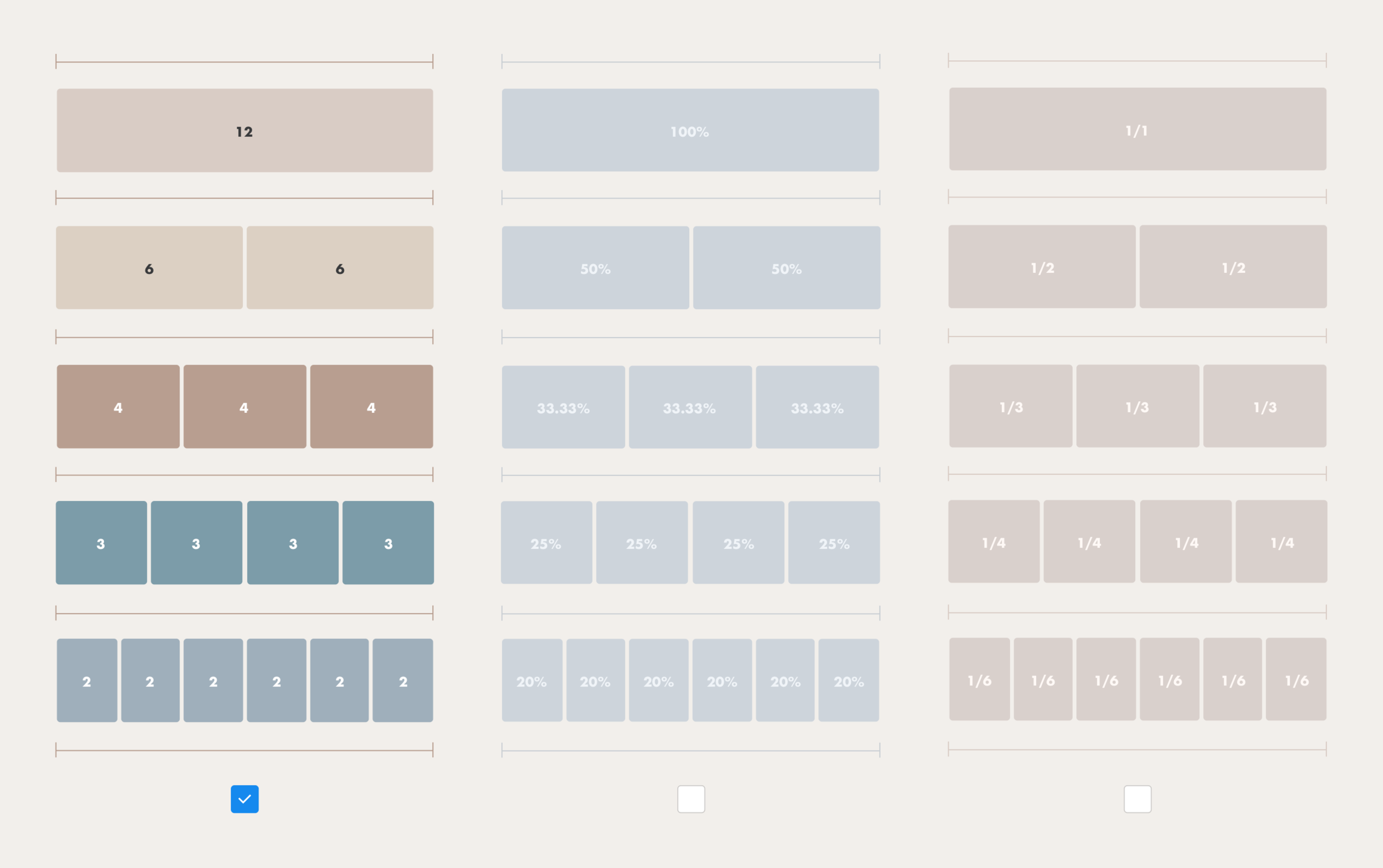
In addition to being a widely used system across the web, Salesforce’s own Lightning Design System uses the 12-column grid system as well.
CONFIGURATION PANEL ITERATIONS
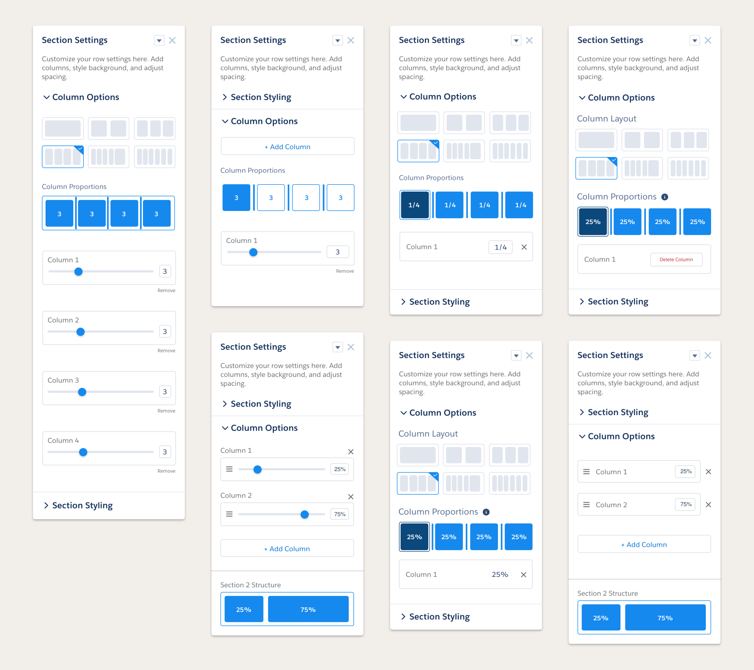
Some design explorations included a combination of different UI patterns and terminology like input boxes, sliders, percentages, fractions, grid system, reordering, and explicit CTAs.
03
SOLUTION
The solution was to create a component that spans the entire page width and is divided into 12 columns following the 12 column grid system. The column distribution is controlled by a tool on the component’s property panel. Each column contains site content like images, text, and other components. The user can also style the section itself and add things like background images, borders, and fills.
ADDING A SECTION
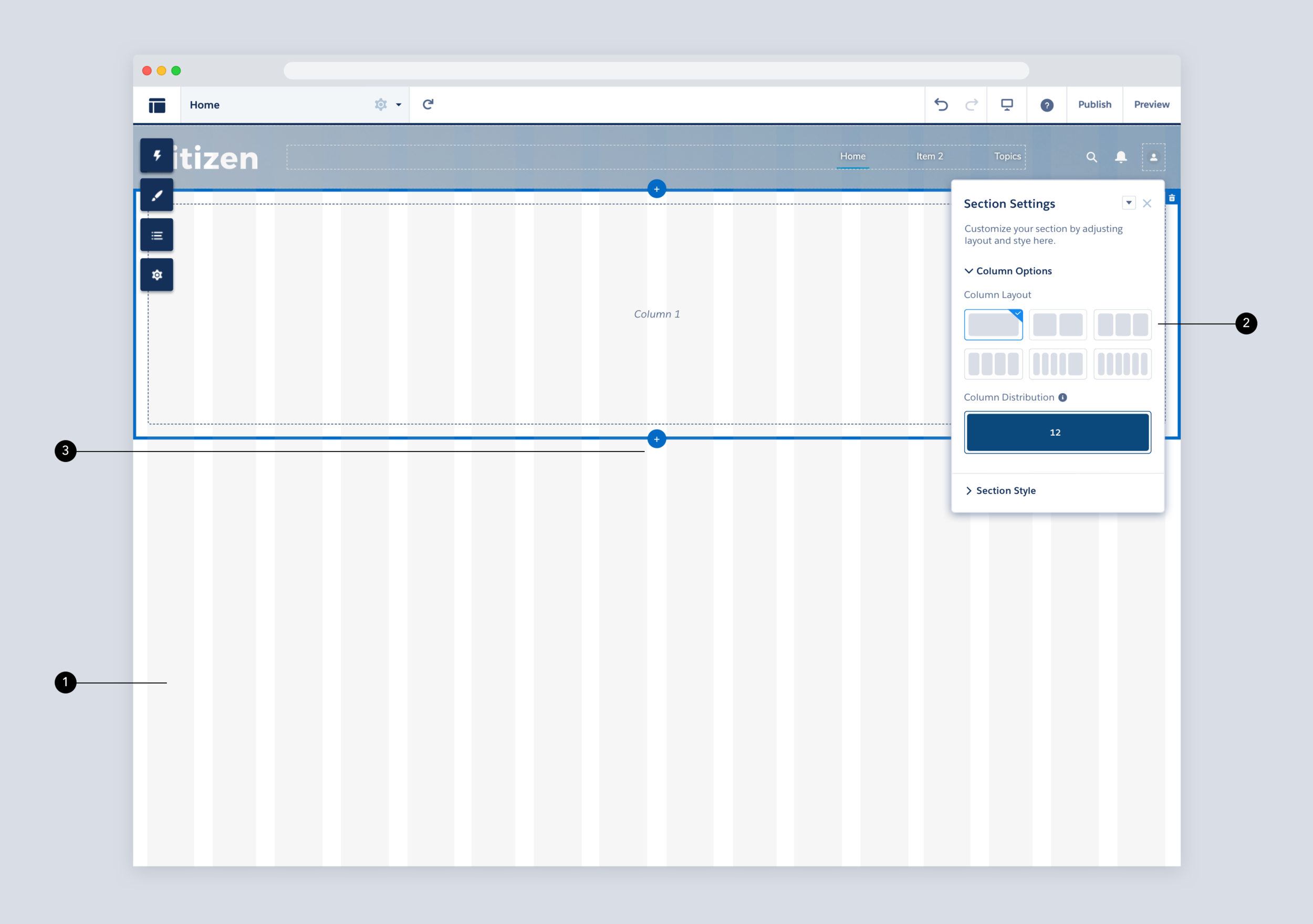
1. Layouts are based on a 12 column responsive grid system.
2. Choose the desired number of columns up to 6 columns.
3. Click to add sections directly on the canvas.
STYLING A SECTION

1. Drill into the Section Style accordion.
2. Add a background image, overlay, and background color.
CONFIGURING A LAYOUT

COLUMN DISTRIBUTION


1. Lorem Ipsum
2. Lorem Ipsum
04
IMPACT
It all begins with an idea. Maybe you want to launch a business. Maybe you want to turn a hobby into something more. Or maybe you have a creative project to share with the world. Whatever it is, the way you tell your story online can make all the difference.
Don’t worry about sounding professional. Sound like you. There are over 1.5 billion websites out there, but your story is what’s going to separate this one from the rest. If you read the words back and don’t hear your own voice in your head, that’s a good sign you still have more work to do.