Flexible Layouts
Salesforce, Experience Cloud
Goal:
The goal of this feature was to allow users to quickly create and manage any page layout using point-and-click UI instead of relying on custom programmed layouts or the existing fixed page layout options. Doing so would reduce build time and implementation costs for our customers and also represent a major step towards the goal of turning Salesforce Experience Builder into a truly declarative site building platform.
Role:
Lead Designer
Cross-Functional Team:
UX, Product Management, Engineering, Research
01
Challenge & Approach
The existing functionality presented the user with a limited set of fixed page layouts to choose from when creating a new page. After selecting a layout, users could not edit or change it. As a result, most customers and implementation partners would eventually end up coding custom page layouts in a process that was long and tedious.
Before - Fixed Page Layouts
Limited set of fixed layouts to choose from.

Before - Redundant Content Region Names
Three header regions, three body regions, and two footer regions on each page.

Explorations
Design explorations included a combination of different UI patterns and terminology like input boxes, sliders, percentages, fractions, grid system, reordering, and explicit CTAs. I ran several user studies to validate which patterns resonated best and found that the 12-column grid system worked best for our target users.
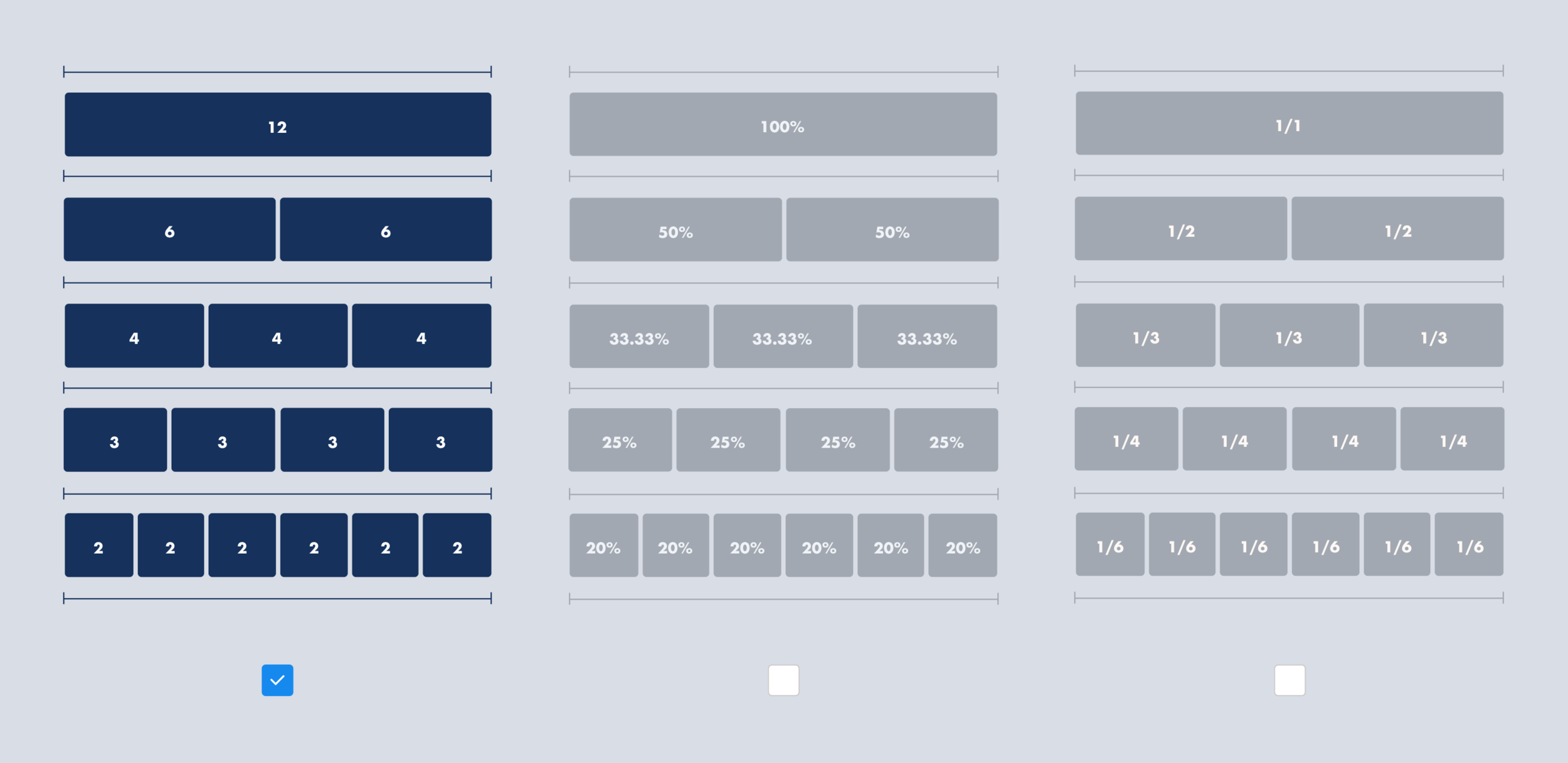
12 Column Grid System
In addition to being a widely used system across the web, Salesforce’s own Lightning Design System also uses the 12-column grid system.
02
Solution
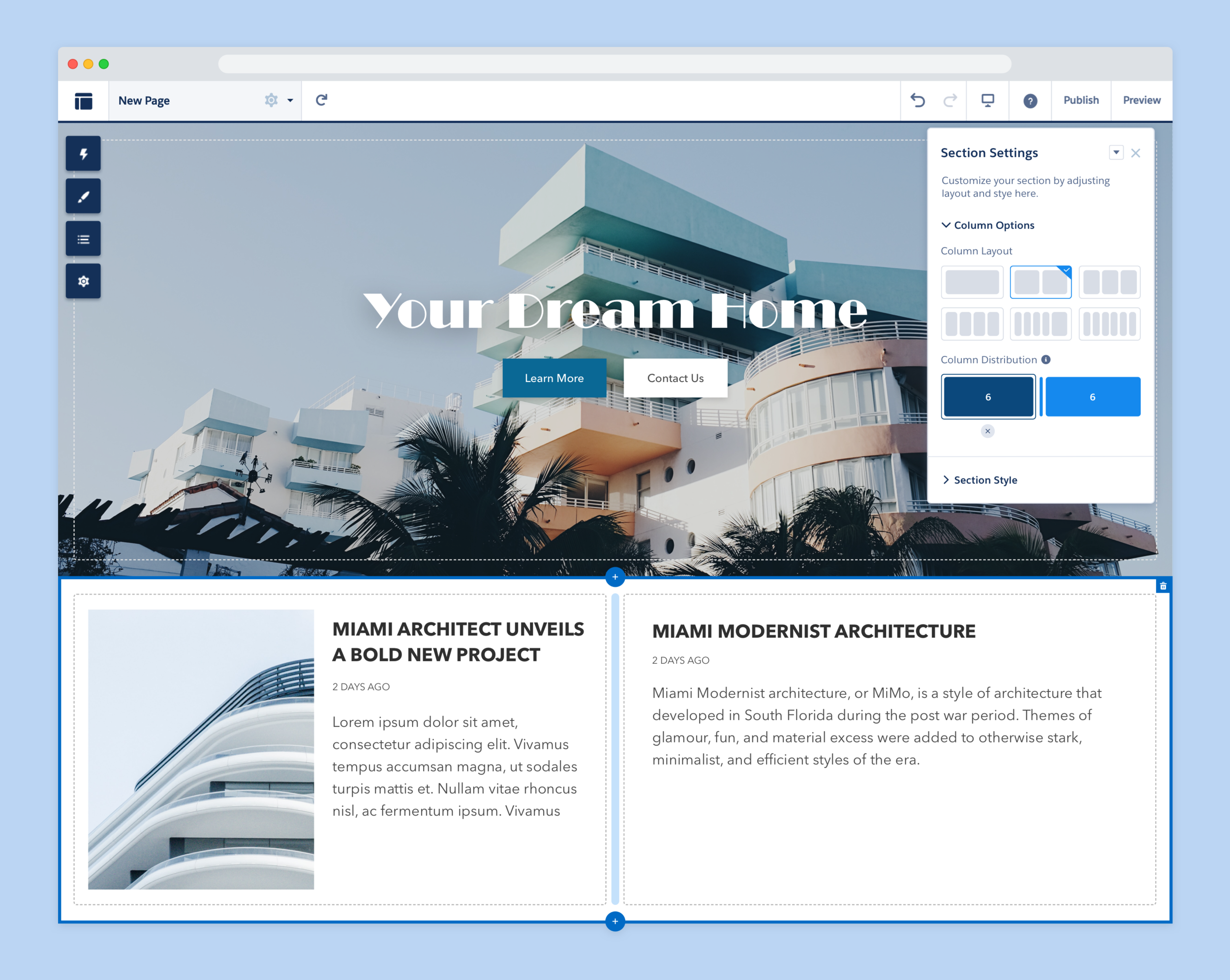
The solution was to create a component that spans the entire page width and is divided into up to 6 content slots following the 12 column grid system. The column distribution is controlled by a draggable tool on the component’s property panel. Each column can contain site content like images, text, and other components. The user can also style the section itself and add elements like background images, borders, and fills.


Styling a Section
Open the Section Style area on the property panel add a background color and image to the section. Customizations include: background color, background image and overlay.

Configuring a Section
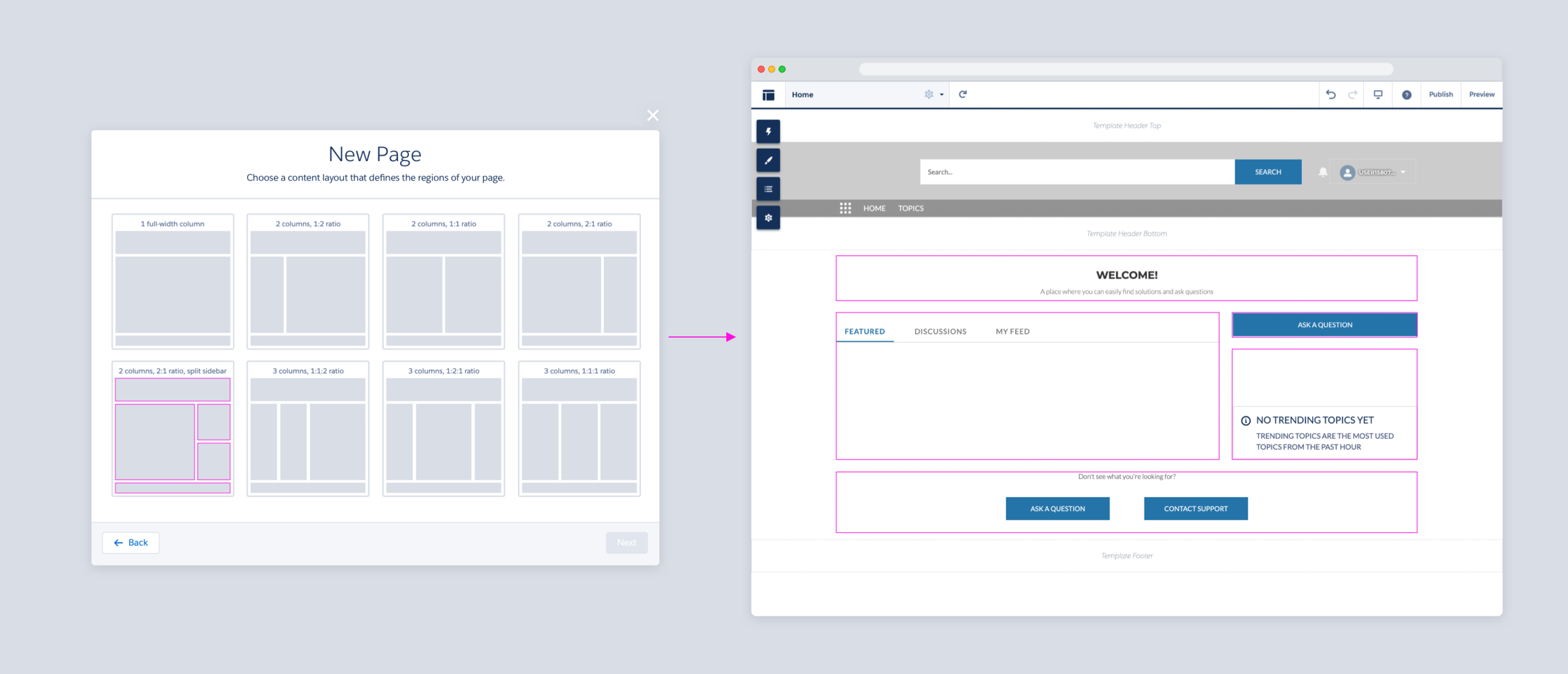
1. Click directly on the “+” on the canvas to add a section.
2. Select the number of columns for each section.
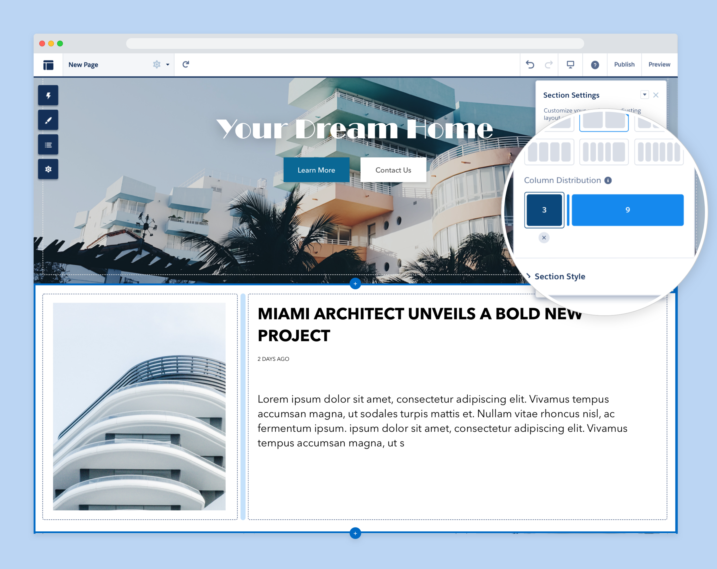
Column Distribution
Customize content distribution by dragging the handle in the column distribution diagram.
03
Impact
This feature enabled admins and marketing designers with no coding knowledge to easily build unique page layouts. It helped greatly reduce implementation costs for our customers who would have had to hire an implementation partner in the past to build a page with a custom layout. Experience Builder was also able to become more competitive with established site builders from companies like Shopify and Adobe which allowed us to onboard customers who would have not considered using Salesforce in the past to build sites.